
You can repaint a wall in an afternoon, but that still leaves four large planes of perfectly smooth drywall staring back at you. If your living room feels more “shoebox” than “sanctuary,” colour alone won’t save it—texture will. Tiny shifts in pile, weave, and profile bounce light in unexpected ways, carving out shadows and highlights that make neutrals look layered and bold hues feel bespoke.
The good news? You don’t need a contractor or a bottomless budget. The eleven quick moves below can each be finished in a weekend, no heavy tools required. Start with one, stack a few more as time (and thrift‑store luck) allows, and watch your space transform from flat to fabulous—literally under your fingertips.
1. Add Cloud‑Soft Bouclé Throws & Cushions
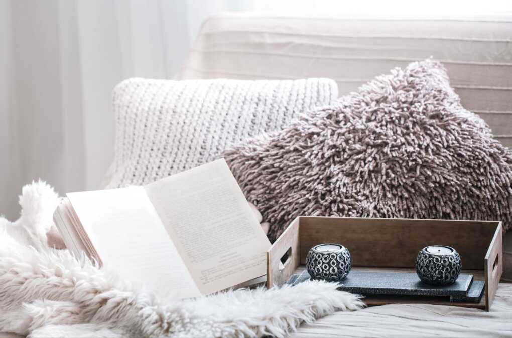
Why it works: Bouclé’s signature looped yarns create miniature hills and valleys that catch daylight at dozens of micro‑angles. Those shadows read as warmth, instantly softening sharp sofa lines and reviving tired greige palettes.
How to pull it off in an afternoon
- Audit your sofa: Keep the existing base cushions but swap out every flat poly‑filled pillow for one bouclé cover in an oatmeal or mushroom tone.
- Layer, don’t match: Pair a nubby bouclé lumbar in the centre with two slightly lighter loop‑pile square cushions. The subtle shift in shade reveals the texture better than a matchy‑matchy set.
- Drape with intention: Instead of folding a throw over the sofa arm, waterfall it from the back cushion so loops tumble forward—this exposes the fabric’s playful depth.
Styling micro‑tips
- Pile heights matter. Mix tight bouclé loops with a deep‑pile sherpa throw for a high/low contrast that feels curated, not chaotic.
- Edge finish counts. A simple knife edge looks modern; a blanket‑stitch border leans cozy cottage. Choose the vibe that suits the rest of the room.
- Mind the season. Stick to breathable cotton‑blend bouclé for summer swaps; reserve the wool blends for cooler months.
Budget hack: Hunt upholstery‑fabric remnants online (look for 1‑yard cuts). A quick envelope pillow cover needs just three straight seams and zero zippers—perfect if your sewing machine is collecting dust.
Designer note: If you worry loops will snag, request a fabric swatch and run a jewellery clasp across it. Minimal pull? You’re good to go.
2. Swap In a High‑Pile Accent Rug
A single rug can shift a room’s mood faster than a paint job, especially when you trade a low, flat weave for something with serious loft. High‑pile (½‑inch or more) catches daylight the way a meadow sways in a breeze—each fibre tilts and darkens differently, creating natural highlights and shadows that make surrounding neutrals feel richer.
Why it works
- Instant depth underfoot – Plush pile visually lifts the furniture it frames, making sofas appear to hover slightly above the floor rather than sink into it.
- Sound softener – Thick fibres dampen footfall and movie‑night echoes without the need for wall panels.
- Colour chameleon – Because yarn tips reflect light, a mushroom‑tone shag can read cooler or warmer throughout the day, adding dimension to a restricted palette.
Design moves to try
- Anchor the zone – Choose a rug large enough that at least the front legs of your seating sit on it; the pile then acts like a textured platform for the entire conversation area.
- Go tone‑on‑tone – Pick a pile colour within two steps of your sofa’s upholstery. The subtle separation lets texture—not contrast—do the talking.
- Contrast the weave – If your sofa fabric is tight (canvas, twill), lean into a looser shag or cut‑and‑loop rug; the textural clash reads deliberate, not busy.
| Pile style | Height | Best for | Clean‑ability |
| Frieze (twist) | ¾‑inch | Casual family rooms | High—loops resist matting |
| Shag | 1 inch+ | Boho or retro corners | Medium—vacuum with brush OFF |
| Cut‑and‑loop | ½‑inch | Modern graphics | Easy—low shedding |
Budget‑savvy swap
Can’t invest in a full‑size shag? Layer a 3×5′ faux sheepskin over your existing flat‑weave. It delivers the same pile pop for a quarter of the cost.
Pro tip: Roll the rug with the pile facing outward before storing; bending the base backing protects the fibres from permanent creases.
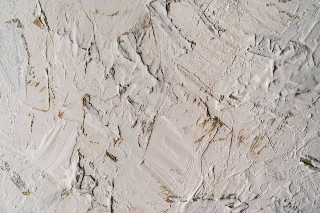
3. Install Slim‑Profile Wainscoting for Instant Shadow Lines

If your walls read as one big blank page, carve in some quiet architecture. Modern wainscoting isn’t the chunky, Victorian moulding you may be picturing; today’s profiles can be as slim as ½‑inch, creating delicate recesses that catch light like pencil shading.
Why it works
- Built‑in texture – Even the shallowest panel depth casts a soft gradient, giving flat paint a surprising sense of movement.
- Visual zoning – A chair‑rail height break naturally frames seating areas, turning a floating sofa into a defined conversation nook.
- Budget smart – MDF kits start around $3 / sq ft and install with brad nails and caulk—no table saw required.
Quick install cheat‑sheet
- Map the rail height – 34–36 inches from the floor feels classic; go lower (28 in.) in rooms with 8‑ft ceilings to keep proportions airy.
- Buy pre‑primed rails & stiles – Saves a coat of paint and ensures crisp edges.
- Level the first rail – Everything else references this line; a tiny tilt will haunt you.
- Caulk, then paint – Caulking seams before painting hides hairline gaps and gives a seamless, built‑in finish.
Need visuals before firing up the nail gun? Check out this step‑by‑step walkthrough that shows room‑by‑room examples and exact spacing tricks.
Design tip: Paint wainscoting and wall the same colour in a matte finish. The matching hue keeps things modern, while the panel shadows supply all the contrast you need.
4. Introduce Vertical Ribbed Wood on a Single Wall
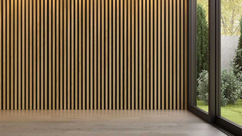
If your sofa wall still feels like a blank page after paint and pillows, bring in a narrow ribbed‑wood panel—thin battens mounted edge‑to‑edge so the grooves run floor‑to‑ceiling. Think of it as corduroy for your room: the up‑and‑down ridges catch light at different angles, adding quiet movement without shouting for colour.
Why this trick punches above its weight
- Instant “built‑in” feel – Even MDF slats look bespoke once they’re sprayed one tone lighter than the wall.
- Ceiling boost – The vertical pattern draws the eye upward, making an 8‑foot room read taller.
- Acoustic bonus – Those grooves scatter sound, softening echo in an open‑plan layout.
Spec it smart
- Sweet‑spot repeat: 18 mm slat / 12 mm valley keeps texture visible without feeling like a radiator.
- Height hack: Stop 4 inches below the crown moulding, then paint the gap the same colour as the ceiling—the panel looks embedded, not tacked on.
- Finish choice: Matte for calm, satin if you want a subtle sheen in evening light.
Installation snapshot (weekend project)
- Mark studs, snap a level line.
- Glue‑and‑pin pre‑made slat panels (they arrive like giant picture frames—no fiddly spacing).
- Fill nail holes, sand, spray.
- Cap with a ¾‑inch square moulding for a finished edge.
Time: 4–5 hours active; Cost: ≈ $7–$10 / sq ft in primed MDF.
Designer micro‑move: Align artwork hooks inside the valleys so the wire disappears—your print appears to float on the ribbing.
Budget‑savvy swap
Painted plywood strips work too: rip ¼‑inch plywood into 2‑inch strips, space them with tile spacers, and roll the whole wall one tone deeper than your base colour for a modern shiplap vibe—at half the cost of pre‑made panels.
Ribbed wood is proof that texture can be as simple as repeat + rhythm. One accent wall, and suddenly every flat surface in the room feels more intentional.
5. Layer Light With a Pleated Fabric Lamp Shade
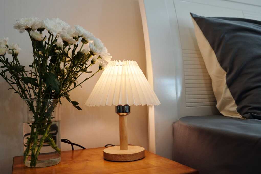
Texture isn’t only something you touch—it’s how light lands. Swap a plain drum shade for a crisp pleated one and you’ll see the change the moment you flip the switch: each fold becomes a tiny reflector, scattering soft beams at different angles and giving neutral walls a warm, lantern‑like glow.
Why pleats beat plain
- Micro‑shadows on demand – The peaks and valleys create subtle striping that turns a bland light pool into atmospheric mood lighting.
- Portable upgrade – Unlike wall treatments, a shade can move with you (or just migrate to another room when you restyle).
- Colour‑quiet drama – Even in snow‑white linen, the geometry of the pleats delivers depth—perfect for texture‑first spaces that avoid bold hues.
Design moves to try
- Tone‑on‑tone layering – Use an ivory pleated shade over an alabaster ceramic base; the similar colours allow the texture to speak.
- Offset the symmetry – Place a pleated floor lamp just off‑centre behind your sofa so light grazes down onto ribbed‑wood panelling (see Trick #4) and doubles the shadow effect.
- Go wide, not tall – A slightly wider shade shows off more pleats and casts a broader, softer cone of light across rugs and upholstery.
Pro tip
Choose a warm‑white LED bulb (2700–3000 K). Cooler light flattens fabric folds, while warm light deepens them, enhancing the texture play.
Budget‑savvy swap
Have a lamp you love? Order a pleated shade only (look for “UNO fitter” or “spider fitter” to match your harp) and keep the existing base—an under‑$40 tweak that feels like a bespoke fixture.
6. Hang a Textured Canvas or Plaster Art Piece
A gallery wall of prints is lovely—but flat cuts flat. Swap one framed poster for a tactile art piece: a hand‑troweled plaster canvas, a sand‑coated abstract, or a DIY joint‑compound relief. The raised strokes catch side light and cast delicate shadows, delivering sculptural presence without claiming floor space.
Why it works
- Built‑in dimension – Even a ¼‑inch ridge throws a shadow, adding instant depth on a colour‑light wall.
- Light‑play focal point – Directional lamps graze the surface, making the artwork shift mood from day to night.
- Customisable palette – Because the medium is texture, you can keep the finish pure white, tint it sage to echo your sofa, or glaze it charcoal for contrast.
Quick styling moves
- Hang a single 24‑inch square above a console for a gallery‑like focal point.
- Or stack three narrow plaster panels vertically to elongate a low‑ceiling corner.
- For an ultra‑organic vibe, frame the piece in unfinished walnut—wood grain beside rough plaster is a texture match made in heaven.
DIY shortcut
Joint‑compound hack: Spread pre‑mixed drywall mud over a primed canvas, drag a notched trowel in sweeping arcs, let dry, then top‑coat with leftover wall paint.
Budget‑savvy swap
Thrift a large cork pin‑board, coat it with two layers of chalky paint, then press crumpled tissue paper into the wet surface. Once dry, seal with matte polyurethane for a linen‑like relief that costs under $20.
7. Stack Two Rugs for Depth & Definition
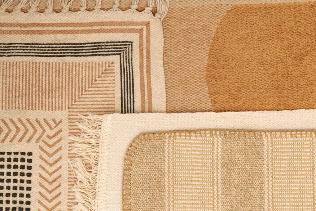
One rug grounds a room; two layered together add instant dimension and help zone your seating area—zero construction dust required. Let a generous, low‑key base rug peek out beneath a smaller statement piece to create a subtle border that makes furniture feel intentionally placed rather than adrift.
Why it works
- Shadow framing – The drop between layers casts a slim outline that visually contains your coffee table and sofa.
- Mixed hand‑feel – Pairing a flat‑weave base with a plush topper gives your feet (and eyes) a change in texture, elevating even a tone‑on‑tone palette.
- Budget zoning – Can’t afford a wall‑to‑wall? A layered combo delivers the same “area rug” impact with smaller, more affordable pieces.
Sizing cheat sheet
| Room size | Base rug | Top rug |
| Under 12 × 12 ft | 6 × 9 natural jute | 4 × 6 patterned wool |
| 12 – 16 ft long | 8 × 10 sisal | 5 × 7 Moroccan shag |
| Open‑plan >16 ft | 9 × 12 flat‑weave cotton | 6 × 9 vintage kilim |
Texture combos that never clash
- Flat sisal + tufted geometric: earth meets cloud.
- Braided jute + hand‑knotted Persian: rustic meets refined.
- Low‑pile polypropylene + sheepskin: family‑proof base, luxe accent.
Need visual guidance? This step‑by‑step rug‑layering tutorial breaks down pattern mixing and overlap ratios.
Quick budget tip – Flip large IKEA flat‑weaves over to reveal a muted underside, then drop a vintage runner on top. The contrast feels intentional, and the flip makes the lower rug look bespoke.
Finish the look – Secure the stack with carpet tape at the corners to prevent creep, and echo the top rug’s accent colour in nearby throw pillows for cohesion.
8. Mix Gloss Levels With Ceramic & Matte Vases

If every surface in a room has the same sheen, light just bounces once and stops. Introduce contrasting glaze finishes—high‑gloss ceramic beside chalk‑matte pottery—and suddenly your console table becomes a mini‑landscape of reflections and soft shadows.
Why it works
- Light choreography – A glossy vase bounces highlights onto surrounding objects, while a matte piece soaks them up, creating an immediate push‑pull that adds depth.
- Eye‑level texture – Unlike rugs or panel moulding, vases sit in the sightline, so their finish changes how you read the entire vignette.
- Scale‑friendly – Works on a narrow mantel as well as a wide coffee table; simply adjust vessel sizes.
Styling moves
- Triad rule – Use three vases: one tall and glossy, one medium and matte, one small with a semi‑sheen. The varied heights and finishes feel collected rather than staged.
- Colour echo – Keep glazes within the room’s palette (e.g., grey gloss + sage matte) so the sheen difference, not colour, takes centre stage.
- Add a tactile bloom – A single stem of dried palm or pampas adds another texture tier without crowding the display.
Quick DIY finish hack
Spray a thrift‑store vase with clear gloss enamel and leave its ceramic partner uncoated. Instant mixed‑sheen duo for under $10.
Budget tip
High‑gloss pieces often show up in clearance aisles because bold colours go out of season fast. Nab the shape you like, then hit it with a couple of coats of neutral spray paint—shine intact, palette perfected.
9. Add Cane‑Webbing Doors to TV Console
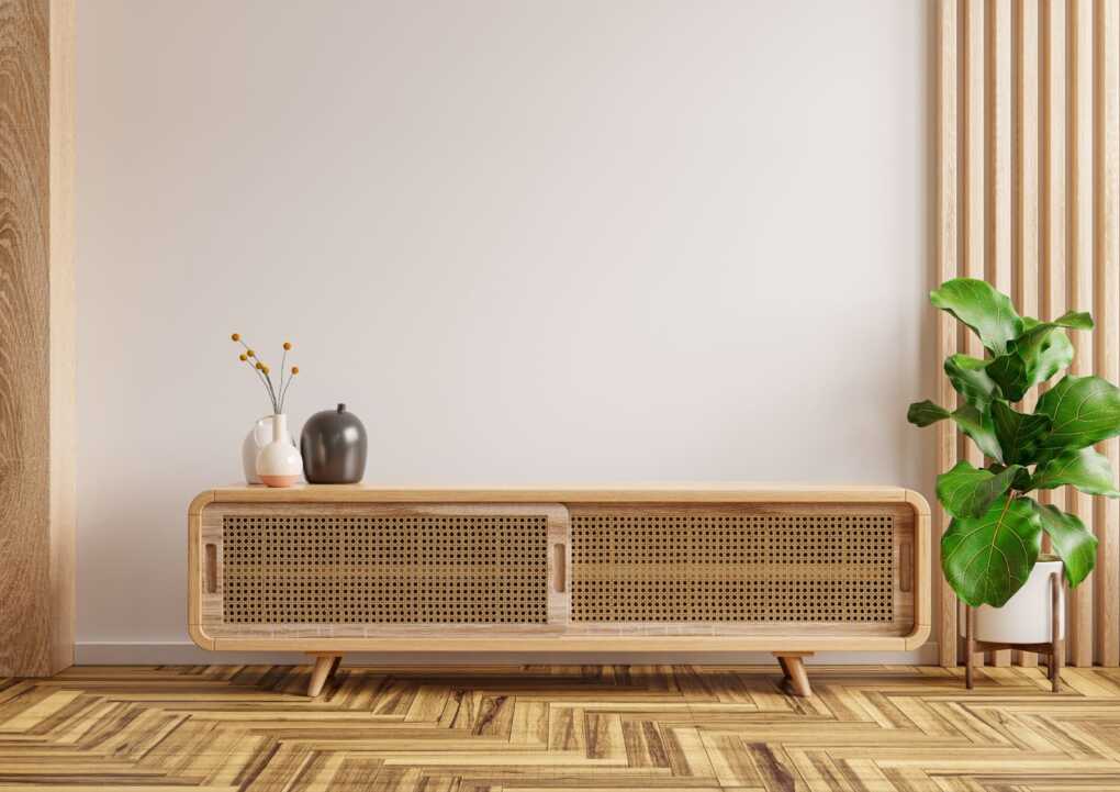
Electronics bring entertainment—unfortunately, they also bring a sea of slick black plastic. Swapping solid MDF doors for breathable cane‑webbing panels breaks up that tech sheen with an airy, woven texture that feels equal parts vintage and contemporary.
Why it works
- Visual lightness – The open weave lets glimpses of wall colour peek through, lifting what’s often a dark entertainment block.
- Texture contrast – Rattan strands have subtle ridges that play nicely against smooth media components and lacquered shelves.
- Airflow bonus – All those amp and console fans finally get to breathe, reducing heat build‑up without visible vents.
How to pull it off
- Order ready‑made cane panels (or strip the fabric from inexpensive cabinet doors and staple cane to the back).
- Add a slim poplar frame in the same paint colour as the console to keep edges neat.
- Finish with soft‑close hinges so the lightweight doors don’t rattle.
Design moves to try
- Match the cane tone to a woven basket or pendant lamp across the room—it creates a subtle echo that feels curated.
- Paint the console a muted olive or charcoal so the pale cane really pops.
Budget‑savvy swap
If a full console makeover isn’t in the cards, wrap a pair of IKEA Knoppäng frames with cane off‑cuts and lean them against the media unit for a similar vibe.
10. Use Linen Sheers Over Existing Blinds
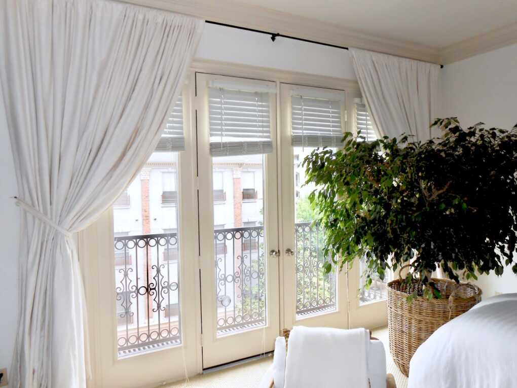
Blinds give you privacy, but on their own they read as crisp, flat planes. Layering airy linen sheers in front softens those lines, diffuses daylight into a gentle glow, and adds a whisper of movement every time the window catches a breeze.
Why it works
- Soft-focus filter – The open weave scatters incoming light, blurring harsh shadows on walls and furniture.
- Added depth – The slight gap between blind and sheer creates a shadow pocket, lending dimension to the window wall.
- Temperature help – Linen fibres breathe, letting hot air escape while still trimming glare.
How to pull it off
- Choose off‑white or oat tones – Pure white can go stark; a hint of warmth blends better with most wall colours.
- Mount a slim double rod – Place the sheer rod 3 inches in front of the blind’s header so fabric can billow without snagging.
- Go wide & high – Extend rods 6–8 inches past the window frame and hang 4 inches below the crown moulding (or ceiling) to give the illusion of taller windows.
- Steam, don’t iron – Steaming keeps the natural slub intact and avoids shiny “press lines” that can flatten texture.
Styling tips
- Pair with matte‑black or antique‑brass rods for a subtle material contrast.
- Let hems just kiss the floor—break‑puddles collect dust and counteract the breezy intent.
- Echo the linen’s raw weave with a nubby lumbar cushion on the sofa for cohesion.
Budget idea
Pick up ready‑made 100 % linen curtain panels from big‑box retailers and swap the stock header for clip rings—an instant, high‑end look without custom‑sewing fees.
11. Style a Rough‑Edge Wooden Bowl With Moss

Nothing says “organic texture” faster than a raw‑rim acacia or teak bowl filled with preserved reindeer moss. The wood’s natural fissures and the moss’s plush surface create a tabletop vignette that feels lifted from a forest floor—no watering schedule required.
Why it works
- Dual textures in one vignette – Rugged wood grain meets velvety moss tufts, delivering instant contrast without extra objects.
- Colour pop for neutrals – Moss’s muted chartreuse injects life into beige and grey palettes without veering neon.
- Tactile centrepiece – Guests can’t resist touching the spongey surface—a conversation starter that won’t wilt like fresh flowers.
How to pull it off
- Choose the right bowl – Look for an irregular edge at least 1 inch high so the moss nests securely.
- Line with scrap paper – A single layer keeps loose fibres from falling through natural cracks.
- Pack moss in clumps – Press gently to create soft mounds; vary heights for a mini‑hill effect.
- Optional scent bonus – Tuck a drop of cedar or eucalyptus oil on a hidden cotton ball for a subtle, nature‑inspired fragrance.
Budget tip – If real preserved moss is pricey, cheat with dollar‑store faux moss rocks and sprinkle a handful of coffee grounds underneath for an earthy aroma.
Conclusion — A Room That Breathes Texture
Transforming a neutral living room doesn’t require a full renovation—just a few well-placed textural shifts that catch the light, slow the eye, and stir up a sense of warmth. Whether it’s the cloud-soft loop of a bouclé pillow or the raw edge of a wooden bowl, these moments of contrast turn beige from boring to breath-stealing.
Remember, texture doesn’t just come from fabrics or finishes. It’s in the rhythm of vertical lines, the whisper of linen brushing a sill, and the subtle shadowplay from a paneled wall. The best part? Every upgrade on this list is modular. You can start with one, live with it, then layer more as your space evolves.
Need a jumping-off point? Begin with this room-by-room guide to modern wainscoting for clean lines and quiet charm. Then explore how to layer rugs like a pro to ground your textures in style.
In a world that’s constantly buzzing, let your home whisper back—softly, thoughtfully, and with just enough texture to make it feel alive.