
That feeling is all too familiar. You’re driving through your neighborhood, and you see it. A house that makes you slow down. It’s not just the architecture; it’s the color. It’s perfect. It feels welcoming, strong, and utterly “right” for that home. You pull into your own driveway and look at your house. It’s… fine. But it’s not that house. It doesn’t have that curb appeal. That’s when the question hits you: how on earth do I choose the right paint color for my home’s exterior?
This decision is a big one. It’s a significant financial investment and a visual statement you’ll have to live with for years. Get it right, and you elevate your entire property. You feel a surge of pride every time you come home. Get it wrong, and it’s a daily, expensive reminder of a choice gone awry. But breathe easy. This isn’t a matter of pure luck or mystical talent. It’s a process. A fun, creative, and deeply rewarding process. And we’re gonna break it down, step by step. Let’s transform your home from “fine” to “fantastic.”
If the task of prepping, priming, and painting feels too big to handle on your own, considering a professional exterior painting service can save you time and ensure a flawless, durable finish. They handle the hard stuff.
Look Beyond the Paint Chip: Understanding Your Home’s Context
You can’t just pick a color you love from a tiny square and hope for the best. Nope. The first step is to look around your house, not just at it. The color exists in a world of other colors and elements. Ignoring this is the number one mistake. So, take a walk. A real one. Stand across the street. What’s permanent? Your roof shingles, that beautiful stonework on the front porch, the brick chimney, the paved driveway. These elements have undertones—warm browns, cool grays, rusty reds. Your new paint color must have a conversation with these features, not a screaming match. It’s gotta harmonize.
Also, look at your neighbors. You don’t want to clone the house next door, but you also don’t want to be the neon-pink outlier on a street of earthy taupes. Consider the style of your home too. A Victorian Victorian begs for a more complex, multi-color scheme, while a mid-century modern ranch might shine with a single, bold, saturated color. Context is everything. It’s the foundation.
“The house style and the neighborhood are your guides, not your jailers. They give you a framework within which to express your own personality.” – A Smart Designer, Probably.
Pro Tip:
Gather samples of your permanent elements. A chip of your roof shingle, a piece of your brick, a stone from your garden bed. Bring these to the paint store with you. Hold potential colors right up against them to see the true relationship.
The Magic of Three: Crafting Your Color Palette
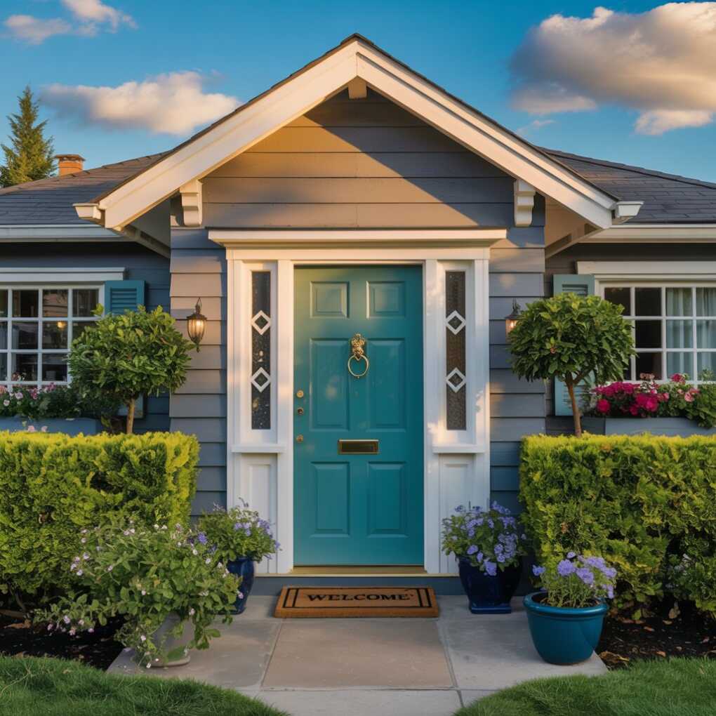
An exterior color scheme isn’t just one color. It’s typically a combination of three: Field, Trim, and Accent.
- The Field Color: This is the main event. The body color. It will cover the largest surface area of your home—the siding. This color often anchors the scheme. Many people play it relatively safe here with neutrals, but that doesn’t mean it has to be boring.
- The Trim Color: This is for all the detailing that frames the house—windows, doors, corner boards, eaves, and fascia. The trim color is your secret weapon for creating contrast and definition. A crisp, clean white or a very light color is classic, but a darker trim on a light field is a stunning, modern choice.
- The Accent Color: This is your chance to have some fun. The accent color is usually reserved for the front door, and sometimes shutters. This is where you can inject a bold pop of personality—a fiery red, a deep navy, a cheerful yellow. It’s a small dose of high impact.
Getting the balance right between these three is key. Too little contrast between field and trim, and the house can look flat and blurry from the street. Too much, and it can look cartoonish. It’s a dance.
| Design Goal | Field Color | Trim Color | Accent Color |
|---|---|---|---|
| Classic & Timeless | Warm White | Bright White | Navy Blue |
| Modern & Bold | Charcoal Gray | Light Gray | Vibrant Orange |
| Warm & Inviting | Olive Green | Cream | Terracotta |
| Coastal & Fresh | Pale Blue | White | Coral Red |
Test, Test, and Test Again: The Unskippable Step
This is non-negotiable. You must test your colors on your actual house. Paint chips lie. They look completely different under your specific light conditions, next to your roof, and on your siding material. Buy sample pots of your top two or three choices for each element of your trio.
Paint at least a 4×4 foot swatch of your field color on multiple sides of your house—one that gets full sun, one that’s in shade. Do the same for trim color right next to it. See how the light changes the color throughout the day. That soft gray you loved at noon can look like a cold, gloomy blue at dusk. Live with the samples for a few days. Look at them in the morning light, the harsh afternoon sun, and under your porch light at night. This patience is what separates the good from the great.
Pro Tip:
Don’t paint your samples right next to each other on the same wall. The colors will visually bleed and influence how you see the other. Paint them on separate walls, but always adjacent to a permanent feature like the roof or brick.
Technical Considerations: It’s Not Just About Looks
Color is emotional, but painting is practical. A few technical factors can make or break your result.
- Light Exposure: As we touched on, light is everything. North-facing walls receive cooler, bluer light and can make colors look more subdued. South-facing walls get warm, yellow light all day, which intensifies and warms up colors. East gets warm morning light and cool afternoon shade. West gets cool morning light and blazing warm afternoon sun. Account for this.
- Siding Material: Color looks different on different textures. A color on smooth vinyl will appear more uniform and potentially lighter than the exact same color on rough, porous brick or textured fiber cement, which can absorb light and make the color look darker and flatter.
- The LRV (Light Reflectance Value): This is a secret weapon. Every paint color has an LRV number (from 0, pure black, to 100, pure white) that tells you how much light it reflects. A low LRV (below 50) absorbs heat. This can be a concern in very hot climates as it can potentially affect cooling costs and cause some siding materials to degrade faster. In sunny climates, leaning towards mid-to-higher LRV colors can be a smart, functional choice.
Seeing the Big Picture: Visualization and Inspiration
You’re not in this alone. Use every tool at your disposal.
- Pinterest and Instagram: Create a board specifically for exterior homes you love. Don’t just save them; analyze them. What are the field, trim, and accent colors? What is the roof color? What do you respond to?
- Paint Company Apps: Nearly every major paint brand has a virtual visualizer tool on their website or app. You can upload a photo of your own house and digitally “paint” it with their colors. It’s not 100% perfect, but it’s an incredible starting point for narrowing down options and seeing how a bold accent door might look.
- Drive Around: Your best real-world lab is your own city. Take a weekend and drive through neighborhoods you admire, especially those with homes similar in style to yours. Take pictures (discreetly!) of color combinations that work. Note the details.
Making the Final Decision: Trust Your Gut (But Also Your Process)
After all this research, testing, and obsessing, you’ll likely have it narrowed down to one or two solid options. This is where doubt can creep in. It’s normal. You’re making a big change. But trust the process you’ve undertaken. You’ve done the work. You’ve considered the context, the architecture, the light, and the materials. You’ve seen the colors on your actual home.
Step back. Which one makes you feel happy? Which one feels like “you”? Which one makes your house look solid, welcoming, and part of its environment? That’s the one. Don’t second-guess it. The goal isn’t to choose a color that will win design awards from strangers driving by at 40 miles per hour. The goal is to choose a color that will make you smile every single time you walk up to your front door. That’s the true measure of success. It’s your haven. Your castle. It should look like it.
Ready to take the plunge? A flawless finish starts with flawless preparation. For a stress-free transformation and expert application, exploring professional exterior painting services can be the final, crucial step in bringing your perfect color vision to life.