
You love your sofa. The rug is perfect. The shelving is exactly what you pinned on Pinterest. And yet the room still feels off. Nine times out of ten, the culprit isn’t the furniture—it’s the color.
The right room decor colors can make a small studio feel airy, a cavernous family room feel cozy, and a rental feel unmistakably yours. The wrong ones can drain daylight, clash with your floors, and make you rethink every decision at 11 p.m. on a Sunday. The good news? You don’t need a design degree to get it right.
This guide walks you through exactly how to choose paint colors that suit your style, your lighting, and your square footage. You’ll get a crash course in color psychology in design, a room-by-room playbook, the paint finishes that survive real life, and plenty of budget room updates you can try this weekend. Whether you’re shopping at Home Depot, browsing Sherwin-Williams online, or ordering samples from Benjamin Moore, you’ll leave with a plan.
Color Basics: Theory for Busy People
Let’s start with the four things you actually need to know about color—no art school required.
Hue is the color family: blue, red, yellow. Saturation (also called intensity) is how vivid it is—think cherry red vs dusty rose. Value is lightness or darkness, which is why a pale sky blue and a deep navy are technically the same hue. And then there’s the quiet troublemaker of interior paint colors: undertones.
Every neutral has an undertone. A “white” can lean yellow, pink, blue, or green. A “gray” can skew violet (BM Classic Gray is famous for this) or green (SW Agreeable Gray has a slight taupe warmth). If your beige walls fight with your oak floors or your quartz countertop, it’s almost always an undertone clash.
Warm vs cool colors, and when to use each
Warm colors—reds, oranges, yellows, warm browns, and golden taupes—advance visually and make rooms feel intimate. They’re ideal for north-facing rooms, dining rooms, and anywhere you want to encourage conversation.
Cool colors—blues, blue-greens, violets, and cool grays—recede and make spaces feel larger and calmer. They shine in south-facing rooms flooded with warm light, in bathrooms, and in bedrooms where sleep is the goal.
Color psychology in design, in one breath
- Blues and blue-greens → calm, focus, restful. Best for bedrooms and home offices.
- Greens → restorative, grounding. Universally flattering in 2026 palettes.
- Yellows and warm whites → energizing, cheerful. Great for kitchens and breakfast nooks.
- Earthy browns and taupes → stabilizing, sophisticated. See Benjamin Moore’s 2026 Color of the Year, Silhouette AF-655.
- Terracotta and blush → warm, human, inviting. Perfect accent wall colors for living spaces.
The fastest shortcut to choosing a room palette? Pick the mood you want to feel first, then work backward to the hue.
How Lighting and Room Orientation Change Color
Here’s the part of the guide that will save you the most money: light and color are inseparable. The same gallon of paint can read creamy at noon, taupe at dusk, and borderline gray under LED bulbs at midnight.
How window direction rewires your palette
North-facing rooms receive cool, bluish, indirect light all day. Warm colors do their best work here—a soft greige, a buttery white, or a muted terracotta counteracts the cool cast. Skip icy grays and stark whites; they’ll feel clinical.
South-facing rooms are flooded with warm, golden light from morning to evening. You can get away with cooler, moodier choices—navy, sage green, charcoal—because the light warms them up. This is where moody jewel tones as accent wall colors feel earned, not gloomy.
East-facing rooms are bright and warm in the morning, then cool in the afternoon. Mid-tone colors with balanced undertones (greige, soft sage, pale blush) hold up best.
West-facing rooms reverse that: cool mornings, golden and sometimes orange-tinted late afternoons. Avoid warm yellows or reds here—by 5 p.m., the room will feel overheated.
Artificial lighting matters just as much
- Incandescent and warm LED bulbs (~2700K) push colors toward yellow and orange. Cool blues can look muddy.
- Daylight LEDs (~4000–5000K) are truer to the paint chip but can feel stark in bedrooms.
- CFLs often have a green or pink cast—avoid them when you’re choosing interior paint colors.
The sampling strategy that actually works
- Buy two or three sample pots, not just one.
- Paint 2’×2′ squares on two different walls (one that gets direct sun, one that doesn’t).
- Live with the sample paint swatches for 3–5 full days. Watch them in morning sun, afternoon shade, and under your evening lamps.
- View them at eye level and from across the room, not just up close.
A warm beige that reads creamy in afternoon sun can veer distinctly yellow in north-facing morning light. Testing is non-negotiable.
Room-by-Room Color Strategies
Every room has a job. The colors you choose should help it do that job better. Here’s a quick-reference chart, then the details.
| Room | Best dominant color family | Best accents | Watch out for |
|---|---|---|---|
| Living room | Greige, sage, warm cream | Terracotta, navy, brass | Too-trendy hues on large walls |
| Bedroom | Muted blue, soft green, blush | Warm linen, walnut wood | High-saturation brights |
| Kitchen | White, cream, sage, navy (cabinets) | Matte black, copper | Clashing with quartz or tile |
| Bathroom | Pale blue, seafoam, warm white | Dark grout contrast | Cool gray in small windowless baths |
| Home office | Sage, dusty blue, deep green | Terracotta, mustard | Distracting orange-reds |
| Kids’ room | Soft sage, buttercream, dusty blush | Pops of primary color | Colors that age out by age 7 |
| Entryway | Moody green, charcoal, warm greige | Brass, natural wood | Dark color without enough lighting |
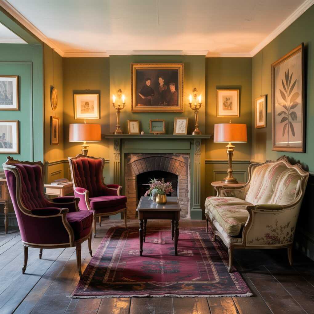
Living room: anchor with flexibility
The living room is the hardest-working room in the house, which is why flexible neutral paint colors usually win as the dominant shade. Warm greiges (SW Repose Gray, BM Revere Pewter) and soft sages give you the most range with furniture and textiles.
If you want more color, push it to an accent wall behind the sofa or to the ceiling (the “fifth wall” trick is trending hard in 2026 homes). Layer texture—bouclé, linen, rattan, unlacquered brass—to keep a neutral scheme from falling flat.
Bedroom: keep saturation low
The best bedroom room color ideas share one trait: low saturation. Dusty blues, celadon greens, pale blush, and mushroom grays read as calming precisely because they’re a step muted. Reserve higher-punch color for bedding, a headboard, or one small accent wall rather than all four walls.
If you love a deep, moody color—navy, aubergine, forest green—consider wrapping a primary bedroom for a cocoon effect. It works especially well with warm metallic hardware and soft textiles.
Kitchen: coordinate with hard finishes
Kitchens are expensive and long-lived, which means color choices here need to survive a decade. White and cream kitchens are timeless, but the current wave favors sage green, navy blue, or warm off-white on lower cabinets, paired with open wood shelving or a light upper row.
Two rule-of-thumb color matching tips:
- Match cabinet undertones to your countertop. Warm quartz (beige veining) → warm cabinet color. Cool quartz (gray veining) → cool cabinet.
- Let your tile backsplash be the second-most-important color, not an afterthought.
Bathroom: light colors expand, dark colors dramatize
Small room color tips 101: pale, slightly warm colors make tight baths feel bigger. Pale blue-green, seafoam, and cream with a gray undertone are the safest bets, especially with subway tile.
If you have a larger or windowless full bath and crave drama, go the opposite direction with deep teal or charcoal and offset it with glossy white fixtures and warm metallics. Moisture-friendly paints with mildew-resistant additives (BM Aura Bath & Spa, for example) are worth the upgrade.
Home office: focus first, creativity second
Studies on color psychology in design consistently point to muted greens and blues as the best focus-enhancing colors. If you do creative work, layer in a warm accent—mustard, terracotta, or coral—in a single chair, a rug, or art. Avoid bright orange-red on large walls; it raises energy but hurts sustained focus.
Kids’ rooms and playrooms: choose colors that grow
The biggest mistake in kids’ rooms is choosing a palette that a child will outgrow by age seven. Lead with a soft sage, buttercream, or dusty blush on the walls, and let bedding, decals, and removable wallpaper deliver the playful punch. Use washable, scrubbable finishes—eggshell or satin—at minimum.
Entryways and hallways: make a fast first impression
Entryways are the smallest rooms with the biggest job. Because you pass through them quickly, they tolerate bolder choices than any other space: moody greens, deep terracotta, charcoal, or the trending Universal Khaki SW 6150 (Sherwin-Williams’ 2026 Color of the Year). These also double as fantastic home staging colors if you plan to sell.
Color Schemes and Combos That Actually Work
Once you have a dominant color, you need a system. Designers lean on a handful of go-to combinations—and one ratio that solves 90% of palette problems.
Classic combinations, decoded
- Monochromatic — one hue in multiple values (light sage + mid sage + deep moss). Effortlessly cohesive, very forgiving.
- Analogous — neighboring hues on the color wheel (blue + blue-green + green). Calm and natural, great for living rooms.
- Complementary — opposite hues (navy + terracotta, sage + blush). High contrast, best when one is clearly dominant.
- Triadic — three evenly spaced hues (navy, mustard, terracotta). Bold and energetic—use in playful spaces, not bedrooms.
The 60-30-10 rule, explained
This is the single most useful framework for room decor colors:
- 60% dominant color (usually the walls)
- 30% secondary color (large upholstery, a rug, curtains)
- 10% accent color (pillows, art, vases, a single chair)
Example palette: sage green dominant (60), warm cream secondary (30), terracotta accent (10). This works in sunlit living rooms with oak floors and brass hardware—and scales beautifully to condos, ranches, and bungalows alike.
Trending palettes in US homes right now
If you’ve scrolled any renovation feed in the last year, you’ve seen these trendy color palettes on repeat:
- Warm greige + earth tones — timeless, resale-friendly, pairs with nearly any wood floor.
- Muted sage + terracotta + cream — the “quiet luxury” palette of 2025–2026.
- Coastal blues + crisp whites — still a dominant look in East and Gulf Coast markets.
- Moody jewel tones (teal, aubergine, forest) — used as accent wall colors or full-wrap studies.
- The 2026 neutrals — Benjamin Moore’s Silhouette AF-655 (deep charcoal-brown), Sherwin-Williams’ Universal Khaki SW 6150, and the supporting “enchanting pales” from BM’s 2026 palette: Raindance 1572, Swiss Coffee OC-45, First Crush CSP-310, and Batik AF-610.
Ready-to-use palette list
- The Quiet Home — Swiss Coffee OC-45 walls, Raindance 1572 built-ins, unlacquered brass fixtures.
- Coastal Modern — Crisp white trim, pale blue-green walls, natural linen and rattan.
- Warm Earth — Sherwood Tan 1054 dominant, cream secondary, terracotta and rust accents.
- Soft Drama — Batik AF-610 (violet-rose) bedroom with walnut bed frame and ivory bedding.
- Classic Moody — Narragansett Green HC-157 dining room, brass pendant, cream ceiling.
Practical Shopping and Paint Selection Tips
Choosing the color is only half the battle. The finish, the brand, and the sampling strategy determine whether your room looks editorial or like a college dorm.
Pick the right paint finish for the job
- Flat / matte — Hides imperfections beautifully; not washable. Use on ceilings and low-traffic bedroom walls.
- Eggshell — The workhorse. Subtle sheen, wipeable, perfect for most living rooms and bedrooms.
- Satin — More sheen, more durability. Ideal for hallways, kids’ rooms, and kitchen walls.
- Semi-gloss — High sheen, very durable. Standard for trim, doors, built-ins, and bathroom cabinets.
BM’s Aura, Regal Select, Sherwin-Williams Emerald and Duration, and Behr Marquee (at Home Depot) are the three tiers most US homeowners reach for. If anyone in your home is sensitive to fumes, look for low-VOC paint options—all of these brands offer zero- or low-VOC lines.
Sample like a pro
Order two to three sample pots—never commit from a 2-inch paper chip. Paint large squares on two walls, label them with a pencil, and live with them through at least three different weather days. If you’re renting or just nervous, Samplize peel-and-stick swatches are a mess-free, rental-friendly decor alternative that ships from most major brands.
The budget hierarchy
If you can only afford premium paint in one area, spend it on:
- High-traffic rooms (kitchen, entry, kids’ rooms)
- High-sheen surfaces (trim, doors)
- Dark, saturated accent wall colors (cheap dark paint often requires three coats)
For low-traffic bedrooms and ceilings, a mid-tier line like Behr Premium Plus performs beautifully.
DIY, Budget, and Quick Updates
You don’t have to paint four walls to change how a room feels. Some of the most impactful budget room updates cost under $150.
Low-cost ways to reset your palette
- Swap textiles first. New curtains, a different rug, and three new throw pillows can rewrite a room’s color story in an afternoon.
- Repaint a single focal point. A front door in deep teal, a powder room ceiling in blush, or built-in shelving in navy delivers outsized impact with a single quart of paint.
- Trade lampshades. A warm ivory shade vs. a cool white shade changes the whole evening mood.
- Use peel-and-stick wallpaper on one wall, inside a closet, or on the back of open shelving.
Rental-friendly decor ideas
Renters, this one’s for you:
- Removable wallpaper (check the return policy on your specific wall paint before committing).
- Fabric tension panels or curtains to cover a wall of color you dislike.
- Command hooks for gallery walls that won’t cost you the security deposit.
- Rug layering—a large neutral jute rug with a smaller vintage rug on top grounds any room, regardless of wall color.
The goal is always the same: anchor one or two dominant room decor colors, then layer in accent colors through pieces you can swap later.
Final Checklist and Quick Action Plan
Before you buy a single gallon, run your plan through this list:
- ☐ I’ve identified the mood I want the room to have (calm, energizing, dramatic, cozy).
- ☐ I’ve noted the room orientation (north, south, east, west) and existing undertones in floors and fixtures.
- ☐ I’ve chosen a dominant, secondary, and accent color using the 60-30-10 rule.
- ☐ I’ve ordered 2–3 sample pots or peel-and-stick swatches and watched them for 3+ days.
- ☐ I’ve matched the paint finish to the room’s traffic level.
- ☐ I’ve picked a low-VOC paint for bedrooms and nurseries.
- ☐ I’m starting with the smallest or least-used area (a powder room, a single accent wall) before committing to the whole room.
The perfect room palette isn’t about following the year’s trends—it’s about choosing colors that feel like you in the light you actually live in. Try one of the palettes above, snap a photo of your finished room, and tag us on social. We’d love to see what you’ve created.