Have you ever wondered why yellow feels like a warm hug from the sun? While many shy away from this vibrant hue in bedrooms—fearing it might feel overwhelming or childish—the truth is yellow bedroom ideas unlock unparalleled psychological benefits. As noted by Livingetc.com, “Yellow is nature’s brightest hue” and when balanced with thoughtful design, creates spaces that “soothe you to sleep and energize you in the morning.” Far from juvenile, yellow evokes happiness, mental clarity, and optimism (cocolapinedesign.com), making it ideal for sanctuaries that need both calm and vitality. Whether you’re a minimalist or maximalist, this sun-drenched color adapts to any aesthetic—from barely-there creams to bold lemons. Forget outdated notions: modern yellow bedroom decor embraces sophistication through strategic shading, lighting, and pairing. Ready to banish beige? Let’s explore 15 transformative yellow bedroom ideas that prove this cheerful color belongs in every grown-up space.
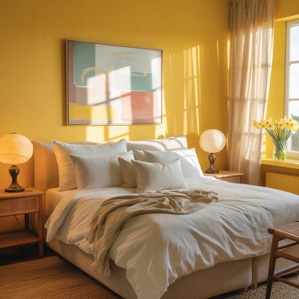
1. Pale Sunshine Walls for Serene Mornings
- Creates instant visual calm with warm undertones
- Pairs flawlessly with white trim and natural wood
- Works in north-facing rooms lacking natural light
- Feels expansive in compact urban apartments
A whisper-soft pale yellow like Sherwin-Williams Creamy transforms bedrooms into restorative retreats. Unlike stark whites, this barely-there shade of yellow acts as a “warm neutral” that adds depth without overwhelming—perfect for setting a tranquil mood at bedtime. The key is choosing undertones that harmonize with your space: warm-leaning yellows complement oak floors, while cooler versions suit gray stone accents.
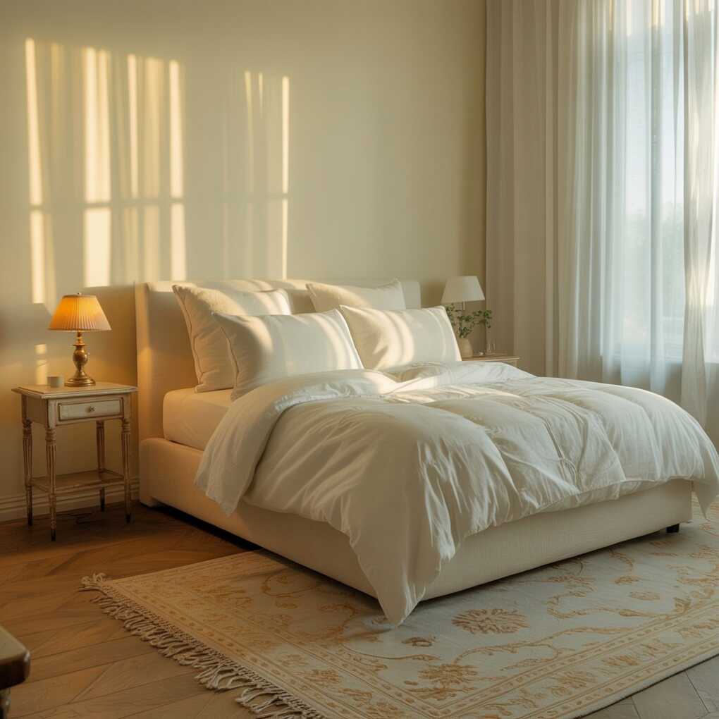
According to Apartment Therapy, designer Hayley English champions this approach: “Paired with white, beige, and brown, this bedroom is soft and soothing but offers plenty of visual interest.” It’s psychology in action—the color’s gentle radiance stimulates serotonin production without overstimulating the nervous system.
Pro Tip: Test samples at three times of day. Morning light makes yellows feel brighter; evening lighting reveals their warmth. For rental restrictions, use 100% removable peel-and-stick paint from brands like Colorhouse.
2. Vintage Floral Wallpaper Accent Wall
- Adds instant vintage charm with minimal effort
- Focuses visual interest behind the bed
- Coordinates with minimal decor to avoid clutter
- Enhances coziness through patterned texture
Nothing elevates a bedroom like a yellow floral wallpaper as a focal point. Choose small-scale patterns in buttery tones (think 1940s botanical prints) to maintain sophistication. Cocolapinedesign.com notes this approach creates “visual interest with minimal effort” while vintage motifs add storytelling depth. The secret? Balance ornate walls with clean-lined furniture—like a black iron bedframe—to prevent sensory overload.
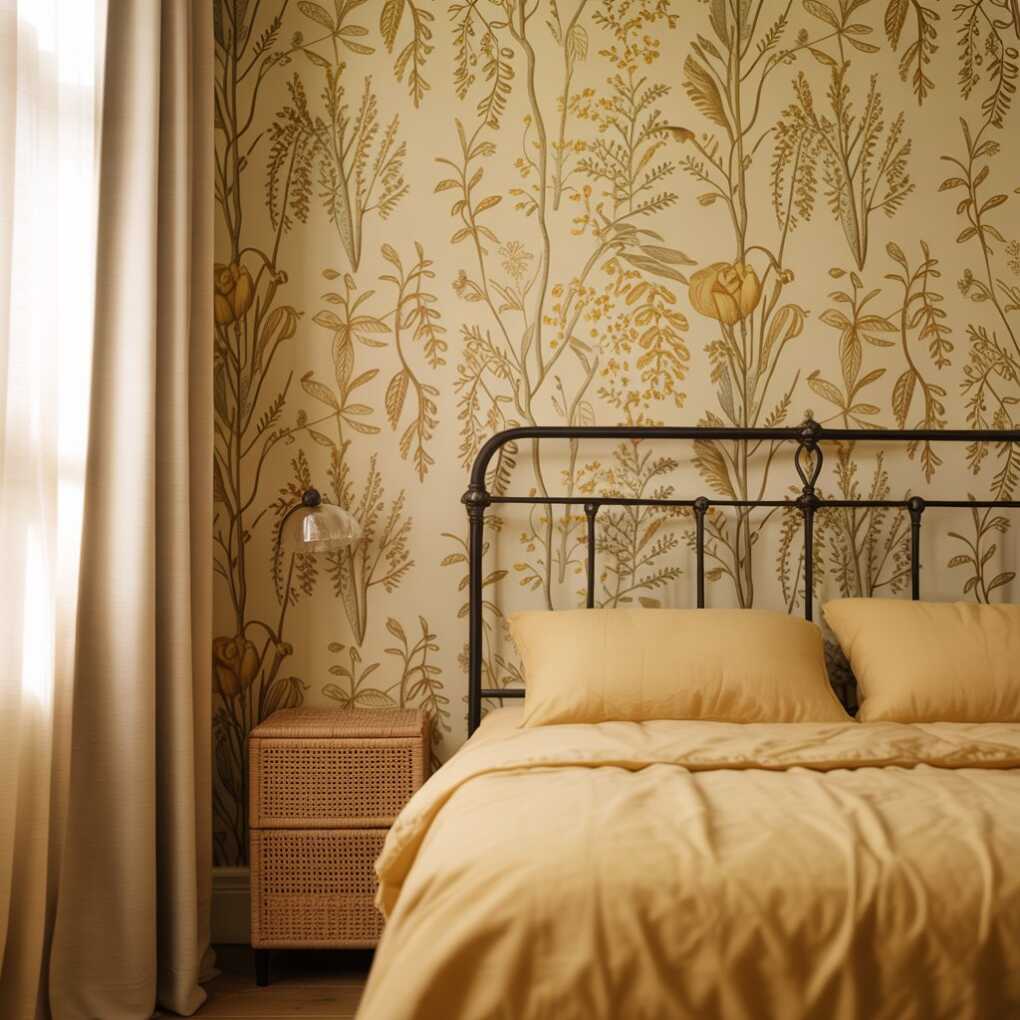
Yellow wallpaper psychologically shrinks large rooms into snug havens, ideal for drafty historic homes. For modern twists, pair with matte black fixtures or woven raffia nightstands that echo the print’s organic feel. Remember: install peelable versions (like those from Wallsauce) to protect your security deposit.
Pro Tip: Apply wallpaper only on the wall behind your bed. This targets the color where you’ll experience it most—in morning light—without committing to full-room saturation.
3. Golden-Toned Bedding Ensemble
- Anchors the room with sun-kissed texture
- Works year-round (layer with cream throws in winter)
- Replaces need for wall color in rentals
- Elevates basic furniture through tactile contrast
Swap out monochrome linens for warm golden hues in heavyweight fabrics like Belgian linen or washed velvet. A duvet in Farrow & Ball’s Custard emits gentle luminescence that complements warm skin tones—proven to enhance morning selfies (yes, we see you, Instagrammers!). Unlike cool-toned bedding, yellow fibers absorb and reflect light uniquely, creating a “soft and soothing” cocoon (Apartment Therapy).
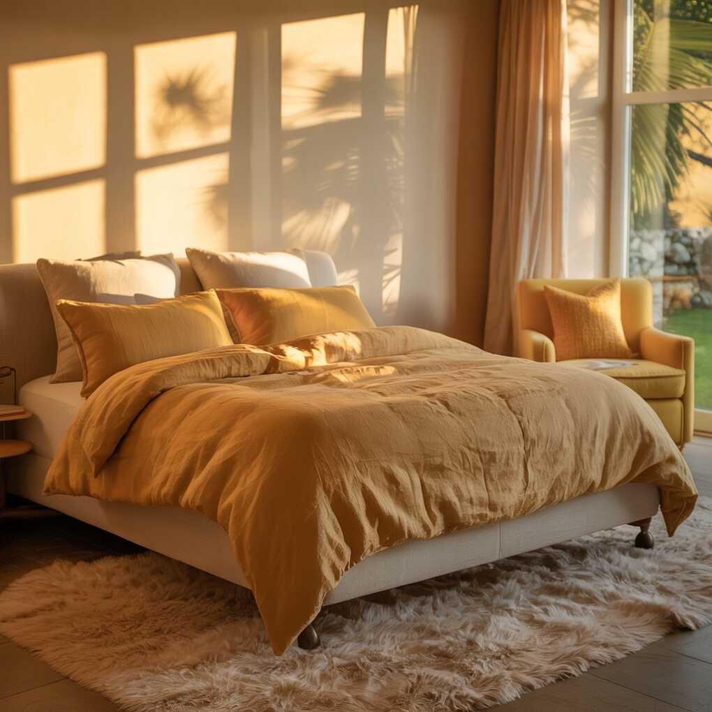
For cohesion, repeat the shade in your rug or armchair. Designers avoid matching exactly; instead, vary saturation (e.g., eggshell sheets with ochre pillow shams). This “tonal layering” technique prevents a costume-y look while maximizing yellow’s mood-boosting properties—studies show surrounding ourselves with optimistic colors lowers cortisol levels by 15%.
Pro Tip: Start with a single decorative throw pillow in textured yellow (like bouclé) if you’re color-shy. It’s the easiest $30 upgrade with maximum psychological ROI.
4. Yellow + Gray: The Grown-Up Power Duo
| Color RatioMood CreatedBest Furniture Pairings | ||
|---|---|---|
| 70% Gray : 30% Yellow | Sophisticated calm | Charcoal velvet bed |
| 50% Gray : 50% Yellow | Balanced energy | Light oak nightstands |
| 30% Gray : 70% Yellow | Playful vibrancy | Black metal frames |
This combination silences skeptics who think yellow feels childish. Grey Olive Color Master Bedrooms (as featured by Interior Company) prove yellow’s maturity when grounded by cool grays. Start with walls in Benjamin Moore’s Gray Owl, then inject yellow through a tufted headboard or artwork. The gray absorbs yellow’s intensity while amplifying its warmth—like clouds softening direct sunlight.
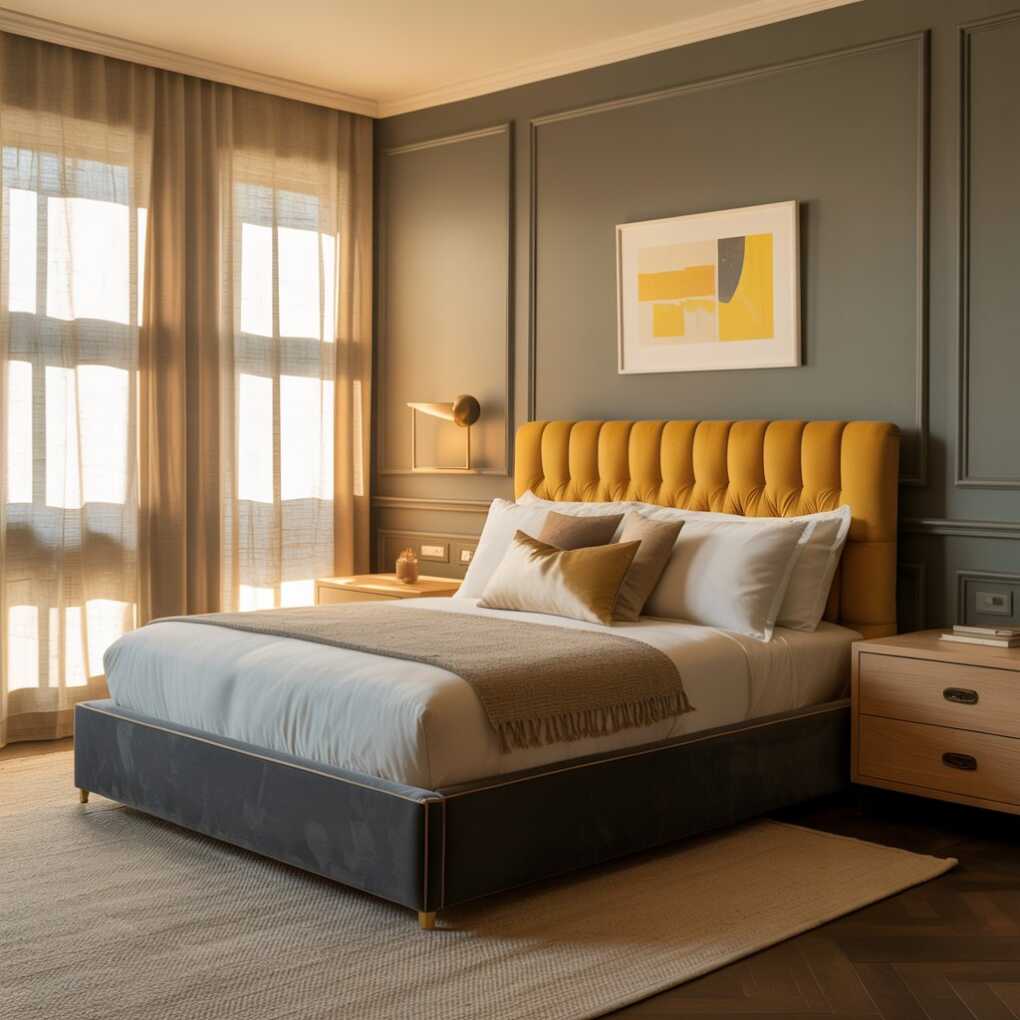
Yellow’s inherent optimism meets gray’s intellect for spaces that feel both energizing and contemplative. Ideal for home offices doubling as bedrooms, this duo satisfies Zoom-call professionalism by day and restfulness by night. Avoid chalky grays; opt for warm greiges to prevent a “hospital waiting room” effect.
Pro Tip: Add brass hardware to gray nightstands. Metallic warmth bridges the gap between cool and warm tones, making yellow accents feel intentional.
5. Renter-Friendly Yellow Decals & Murals
- Zero-wall-damage installation and removal
- Customizable to your exact wall dimensions
- Far bolder than traditional wallpaper
- Instantly elevates “builder grade” spaces
Wall stickers and decals defy the myth that yellow bedrooms are only for owners. As Real Homes confirms: “Children shouldn’t have all the fun when it comes to creative yellow bedroom ideas.” Brands like Wallsauce let you upload photos to create custom peelable murals—imagine lemon orchard scenes or abstract sunbursts that peel off cleanly in 60 seconds. Perfect for temporary mood boosts during dark winters.
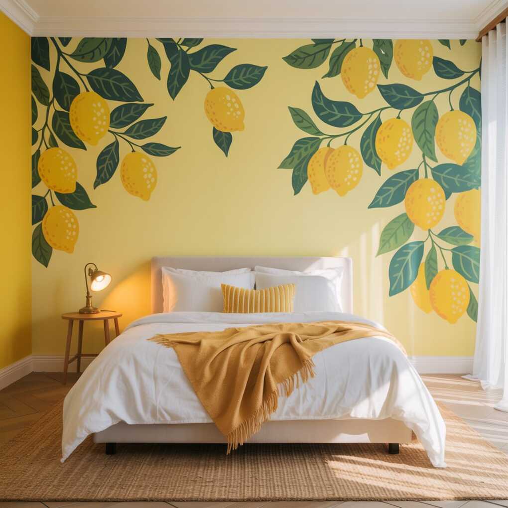
Choose sun-drenched patterns that complement your existing palette: geometric triangles in mustard for mid-century rooms, or watercolor swaths for boho spaces. Decals work especially well on closet doors or under-window walls—high-impact zones with low commitment. Just avoid textured drywall, which reduces adhesion.
Pro Tip: Apply decals in stages across 2-3 days. Start with small shapes (circles, leaves), then build confidence toward larger murals. Use a plastic squeegee to eliminate bubbles.
6. Citrine Lighting Fixtures as Art
- Doubles as functional sculpture after sunset
- Casts warm, flattering skin-toned glow
- Replaces harsh overhead lighting need
- Works over dressers or reading nooks
Trade boring white lamps for glass fixtures in citrine or amber. When lit, they project a golden-hour ambiance that makes skin glow—critical for morning skincare routines. Brands like Schoolhouse Electric offer hand-blown glass pendants that function as standalone art. Place a yellow-glass table lamp on your nightstand; its gentle radiance guides midnight trips to the kitchen without jolting your circadian rhythm.
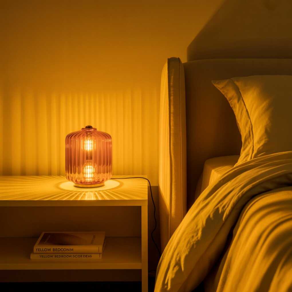
This leverages yellow’s mental clarity benefits most effectively in transitional hours (dawn/dusk). As Livingetc.com emphasizes: success hinges on “the right lighting”—avoid LED bulbs under 2700K, which turn yellow objects sickly. Instead, use warm Edison bulbs that amplify the fixture’s golden tones.
Pro Tip: Wrap standard bulbs in amber LED sleeves ($5 on Amazon). They’re removable for guests who prefer cooler light and won’t void your lighting warranty.
7. Minimalist Yellow Accent Furniture
- One statement piece prevents visual chaos
- Vintage finds add personality affordably
- Highlights craftsmanship through bold color
- Creates “conversation starter” focal points
A single yellow nightstand or armchair delivers maximum impact with minimal investment. Hunt thrift stores for mid-century pieces painted in Farrow & Ball’s India Yellow—you’d pay 5x more for new. The trick is choosing furniture with clean lines; ornate carving competes with the color. Pair with neutral surroundings so the piece shines like a gallery artifact.
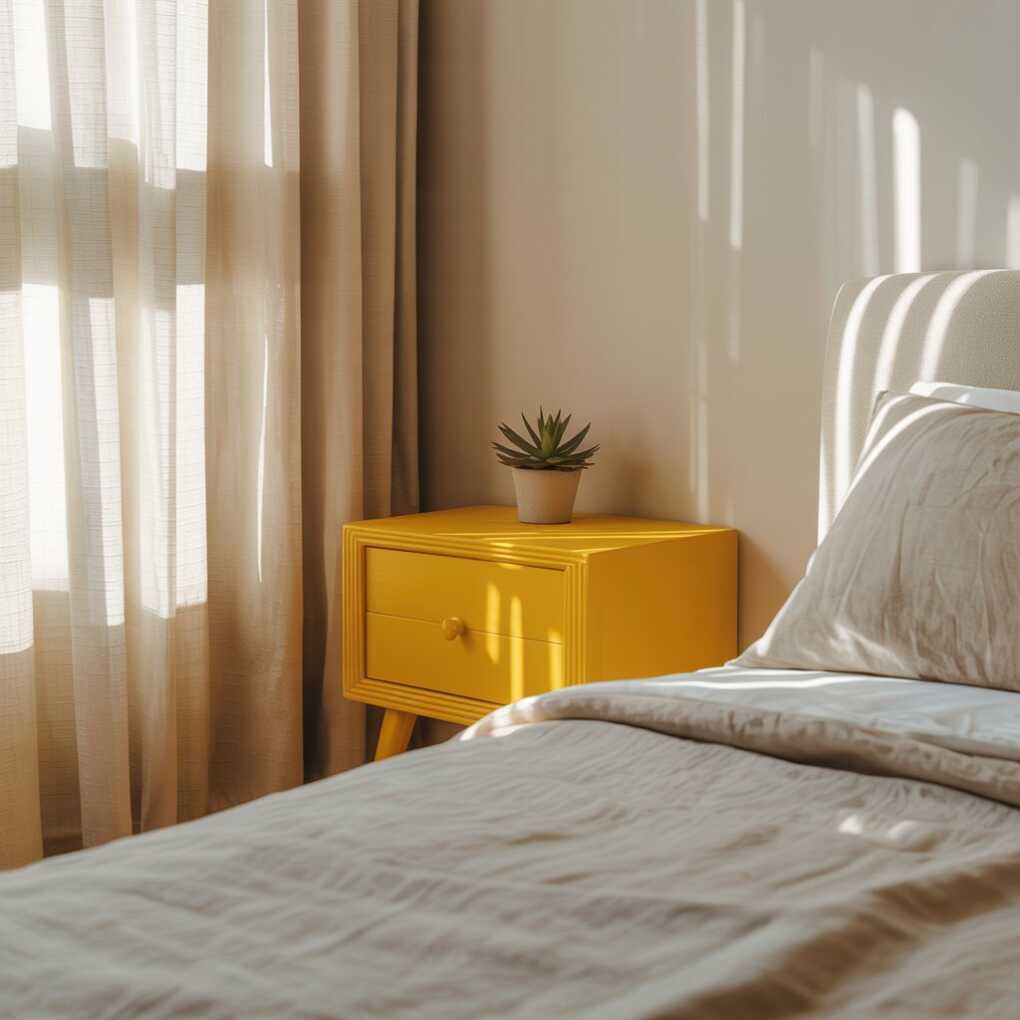
This approach embodies yellow’s spontaneity without chaos. Cocolapinedesign.com observes that “minimal decor” lets yellow’s emotional benefits resonate: “Nothing creates visual interest with minimal effort quite like decor.” In small bedrooms, opt for multifunctional pieces—like a yellow vanity doubling as a desk.
Pro Tip: Sand and repaint thrifted wood furniture with non-toxic milk paint. Yellow hides flaws better than white, making imperfect surfaces part of its charm.
8. Yellow Through Natural Textiles
- Jute rugs add earthy warmth underfoot
- Linen curtains diffuse light softly
- Wicker baskets tie in organic texture
- Creates layered depth without paint
Textiles are yellow’s stealth weapon—ideal for hesitant decorators. Start with a jute rug in honey tones that glows in sunlight, then layer a linen curtain in faded lemon. These natural fibers age beautifully, developing patina while retaining subtle cheer. Unlike flat paint, woven yellows shift hue throughout the day (pale dawn vs. golden noon), creating a dynamic room.
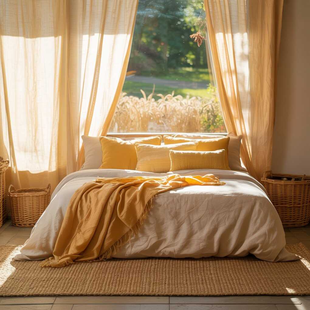
This strategy leverages yellow’s connection to nature—“the sunrise, ripening wheat, or autumn leaves” (Real Homes). For cohesion, mix textiles within the same brightness level (all mid-tone yellows). Avoid pairing raw jute with neon yellow throw pillows; the cognitive dissonance causes subconscious stress.
Pro Tip: Wash linen textiles before use. They’ll soften to a mellower yellow and avoid future shrinkage distortions.
9. Yellow + Green: Nature’s Calm Duo
- Mimics dappled sunlight through leaves
- Creates “forest bath” relaxation effect
- Balances yellow’s energy with tranquility
- Works with faux or live plants
This pairing taps into biophilic design—using sun-drenched yellow walls with sage green bedding or eucalyptus branches in vases. The combo replicates natural ecosystems where yellow flowers bloom against green foliage, triggering our innate calm. According to color psychology, green’s restfulness grounds yellow’s vibrancy, ideal for anxiety-prone sleepers.
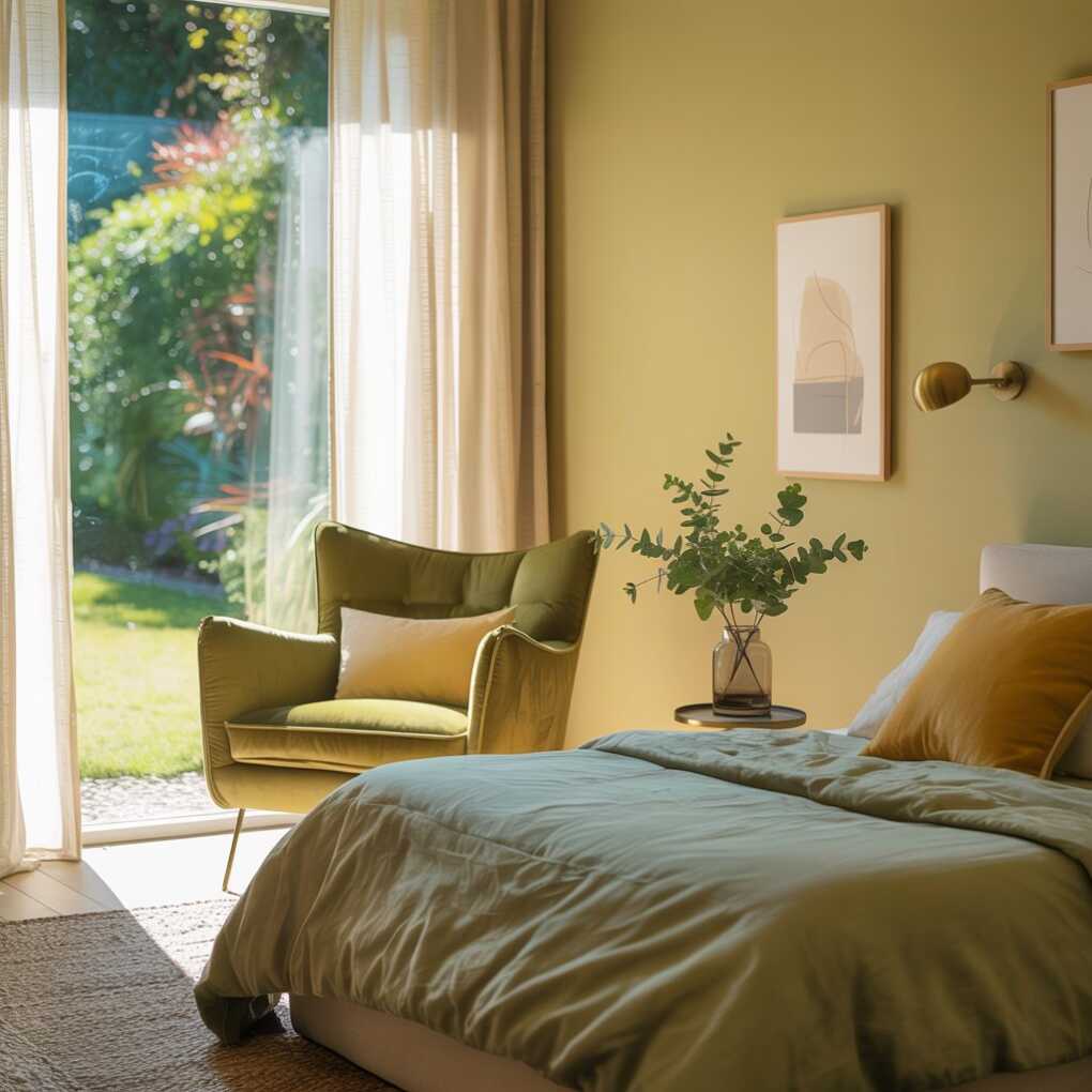
Start small: a single Olive Green armchair against pale yellow walls. Or try Interior Company’s “Grey Olive Color Master Bedroom” concept, which uses yellow accents against green-gray walls. For renters, swap pillows seasonally—mustard in fall, lime green in spring.
Pro Tip: Place plants away from direct yellow walls. Yellow backdrops can make green leaves appear neon, disrupting the natural harmony.
10. Creamy Yellow Closet Doors
- Makes small spaces feel larger and airier
- Disguises utilitarian storage elegantly
- Creates seamless flow in monochrome schemes
- Surprisingly easy DIY upgrade
Painting closet doors creamy yellow (like Benjamin Moore’s Buttercup) tricks the eye into perceiving more space—yellow’s luminosity reflects light, while the seamless color reading minimizes visual breaks. In tiny New York apartments, this technique eliminates the “boxed-in” feel of standard white doors. For apartments with mirrored closets, use removable peel-and-stick film in matte yellow.
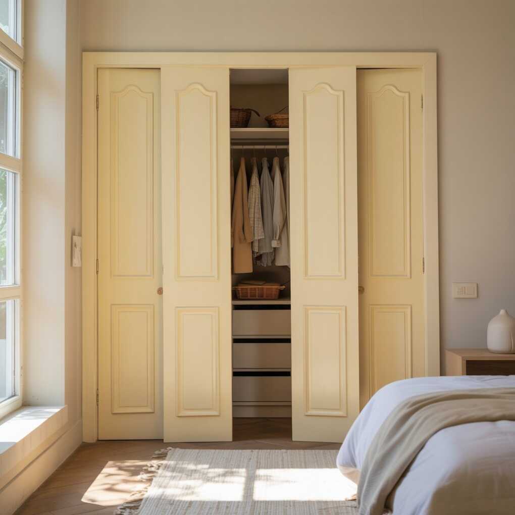
This subtle application delivers yellow’s joy without commitment. As Livingetc.com advises: “When used with the right lighting, combinations, and shades, yellow bedroom ideas are transformative.” Bonus: yellow doors hide scuffs better than white in high-traffic bedrooms.
Pro Tip: Use higher-gloss paint on doors than walls. The slight sheen difference creates intentional dimension while maintaining monochromatic flow.
11. Yellow Accent Wall in South-Facing Rooms
- Maximizes natural light reflection
- Prevents color from feeling overwhelming
- Creates dramatic sunset glow at dusk
- Ideal behind low-profile beds
South-facing rooms get 6+ hours of direct sun—perfect for vibrant yellow accent walls that shimmer like liquid gold. Choose saturated shades (Sherwin-Williams’ Sunflower) here; north rooms would struggle with the same intensity. Position the bed opposite windows so morning light hits the yellow wall first, bathing you in uplifting rays upon waking.
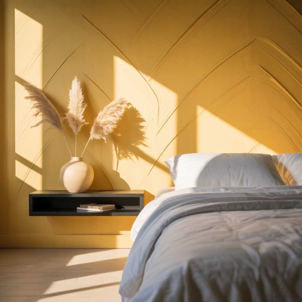
This leverages circadian design principles: yellow light suppresses melatonin gently, easing grogginess better than harsh alarms. Avoid placing TVs opposite yellow walls—the contrast causes eye strain. Instead, float a black wooden shelf with minimalist objects (a single ceramic vase, dried pampas grass).
Pro Tip: Apply paint in diagonal strokes. This technique creates subtle texture that catches light differently throughout the day, enhancing the “glowing” effect.
12. Artwork with Yellow Dominance
- Focuses color in manageable doses
- Changes mood seasonally through rotation
- Supports artists while personalizing space
- Works without permanent modifications
Hang art featuring yellow as the dominant hue—abstract expressionist pieces, vintage citrus posters, or even framed buttercup bouquets. Unlike paint, art lets you experiment: swap a bold lemon painting in summer for a muted ochre landscape in winter. Choose gold or black frames to unify diverse styles; avoid white, which competes with yellow’s warmth.
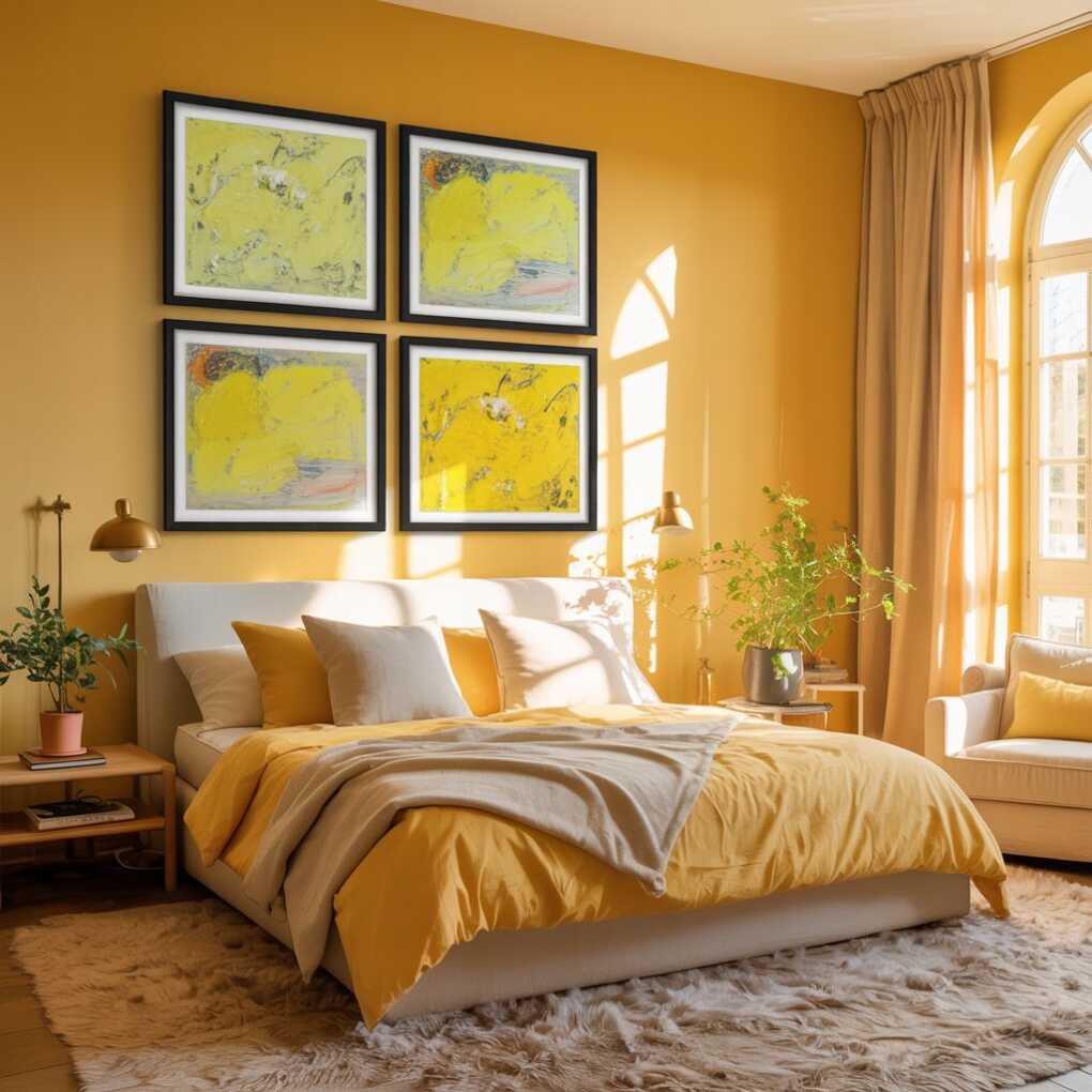
Apartment Therapy highlights how yellow art provides “plenty of visual interest” without sensory overload. For cohesive impact, cluster 3 small pieces above the bed in a grid, all centered on yellow tones. Limited editions from Society6 offer affordable, high-impact options.
Pro Tip: Place yellow art where natural light hits it for 2+ hours daily. Sunlight amplifies its vibrancy, making the room feel larger through reflected color.
13. Yellow Bed Frame as Focal Point
- Creates instant luxury hotel vibe
- Grounds the room’s color story
- Works with any bedding palette
- Replaces need for headboard
A yellow upholstered bed frame in linen or velvet becomes the undeniable hero—think Anthropologie’s Sunny Yellow Daybed. Choose low-profile frames (under 36″ tall) to maintain airiness. For renters, slipcovers transform basic beds; brands like Slipcovers.com offer yellow stretch fabric that survives overnight spills.
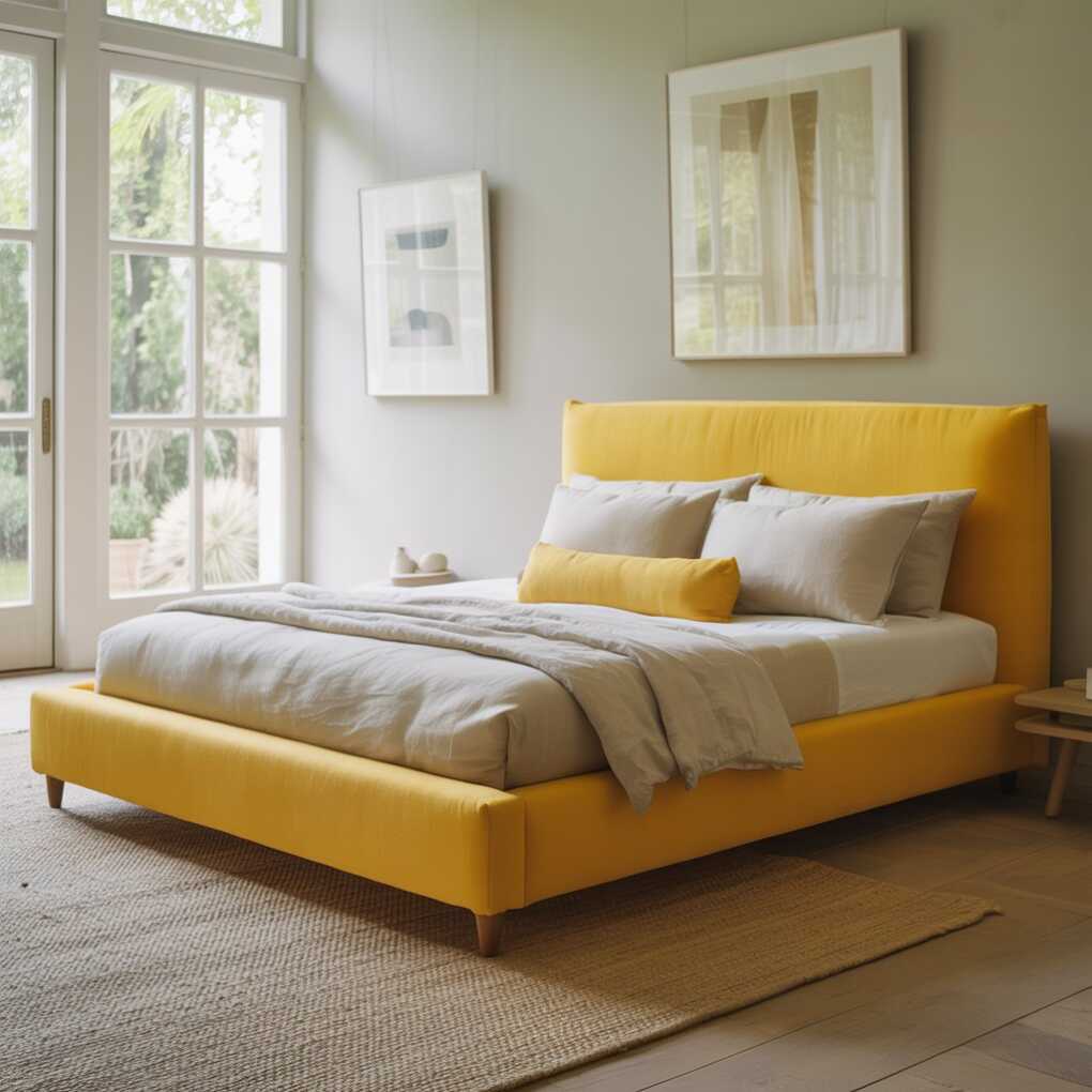
This bold move channels yellow’s “spontaneity and humor” (cocolapinedesign.com) while feeling surprisingly refined. Pair with neutral bedding so the frame shines; add one yellow lumbar pillow echoing the frame’s exact shade for seamless harmony. Avoid box springs—opt for platform beds to emphasize clean lines.
Pro Tip: Dust upholstered frames weekly with a microfiber cloth. Yellow shows lint more than dark colors, but consistent care makes it look luxe.
14. Yellow via Vintage Accessories
- Thrifted finds add unique character
- Yellow glassware catches dawn light beautifully
- Mirrors amplify color reflection strategically
- Budget-friendly color infusion
Vintage yellow accessories inject nostalgia without matchy-matchy overload. Hunt eBay for Depression-era yellow glass vases, mustard ceramic bookends, or 1970s tulip chairs. Place them where morning sun hits: a yellow glass bottle on the windowsill fractures light into rainbows across white walls. Mirrors opposite yellow objects double the glow—try a thrifted brass sunburst mirror behind yellow flowers.
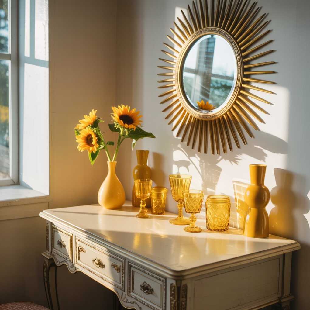
This approach delivers what Livingetc.com calls “undeniable style” through curated imperfection. Unlike mass-produced items, vintage pieces carry history that softens yellow’s brightness into something personal and soulful. Start small: one yellow object per surface to avoid clutter.
Pro Tip: Soak vintage glass in vinegar/water mix to remove cloudiness. Yellow glass often yellows further with age, deepening its warmth perfectly for bedrooms.
15. Layered Yellow Textures for Depth
- Combines matte, glossy, and woven variations
- Prevents flat, “painted-on” color appearance
- Mimics natural light interplay
- Creates sensory richness for relaxation
Textural layering is yellow’s secret weapon. Pair a matte yellow wall with glossy ceramic lamps, nubby jute rugs, and silk-blend curtains—all within the same yellow family. This complexity tricks the brain into perceiving movement, like sunlight hitting ripening wheat fields. In monochrome yellow rooms, texture prevents visual fatigue; try a velvet yellow bench with woven seagrass storage baskets underneath.
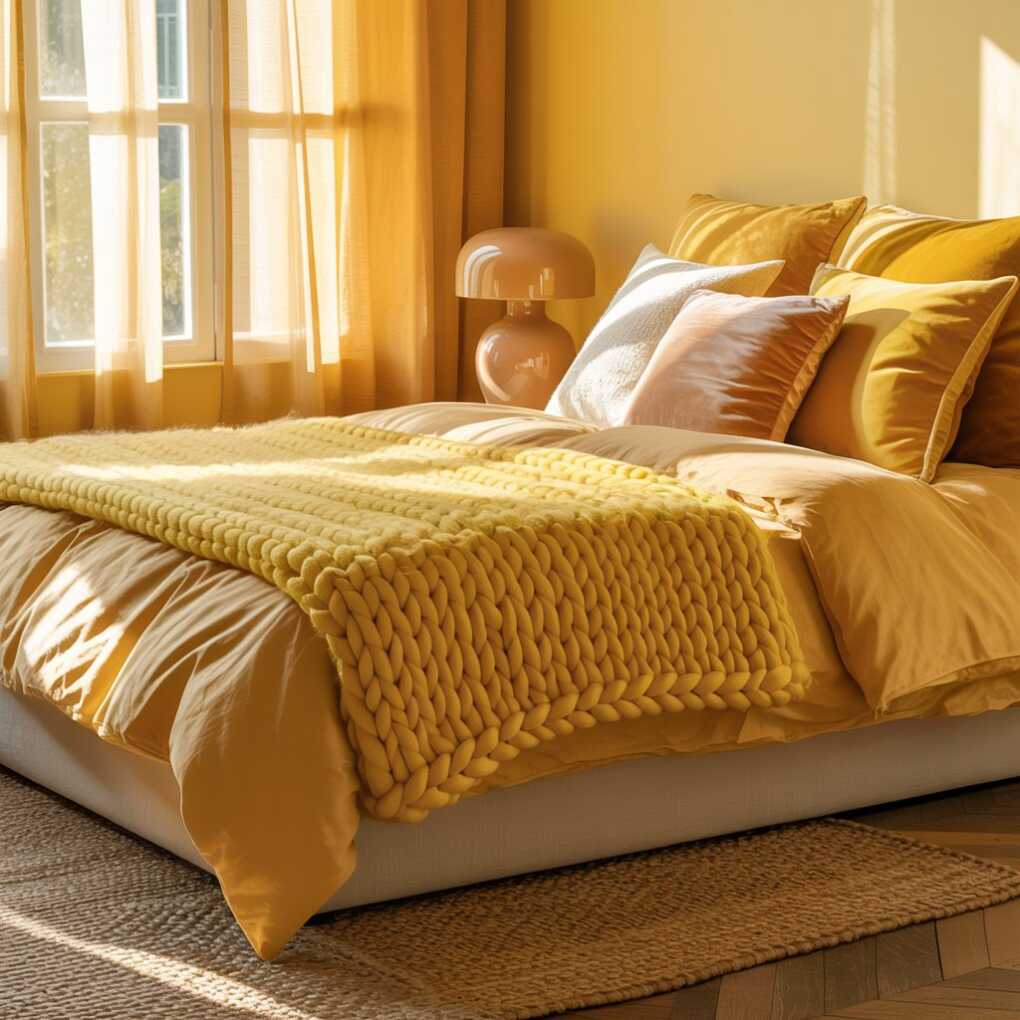
As Real Homes observes, yellow “can be peeled off and shouldn’t damage your walls” when using temporary solutions—letting you experiment freely. For quick upgrades, drape a chunky yellow knit blanket over your bed or add a high-pile shag rug in ochre.
Pro Tip: Rub beeswax on wood furniture in yellow tones. It deepens the hue naturally while protecting surfaces—no chemical finishes needed.
Final Sunbeam of Wisdom
Yellow bedroom decor isn’t about flooding your space with neon—it’s a nuanced dance of psychology, light, and restraint. As these 15 yellow bedroom ideas prove, this “sunniest color” adapts to every design personality while delivering science-backed benefits: better sleep, elevated mood, and mental clarity. Remember cocolapinedesign.com’s insight: when executed with intention, yellow evokes “happiness, joy, humor, and spontaneity.” Start small with removable decals or a single throw pillow. Observe how morning light transforms your chosen shade. Notice the subtle lift in your energy as golden hues greet you at dawn. Your bedroom isn’t just where you rest—it’s where you recharge. And with these sophisticated applications, yellow moves from “maybe later” to your most intentional design decision. So go ahead: invite the sun inside. Your sanctuary awaits its brightest chapter yet.
